JetPunk Wishlist #1-Data Maps
Last updated: Saturday April 6th, 2024
Report this blog
What is a Data Map?
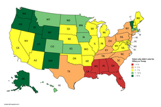
A data map is a map with sections (countries,states,etc) that show a different color or shade of color to represent a different type or level of something. It has to be easy to read and comprehensive at a glance
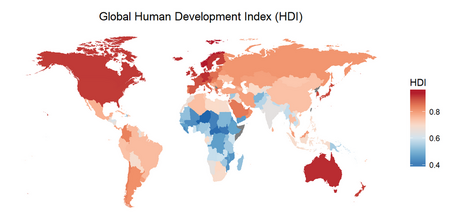
The data map shown above uses a mixture of red and blue to show the HDI (Human Development Index), red being a more advanced (and usually richer) country and blue being a less advanced (and usually poorer).
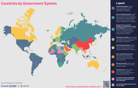
This more complicated map shows different types of Governments and what countries use them. It is harder to read at a glance but shows much more information than the first example.
Why should we add them to JetPunk?
-They would be fun to make and gain their creators acknowledgement
-It would increase site traffic, making it a map website as well as charts, blogs, and mostly quizzes
-They would be interesting to look at and make sourcing easier for quizzes (and charts)
-They would enhance the overall experience on JetPunk
-They can help you learn countries or states
How would we do it?
1. Users can create SVG maps like the countries of the world quiz and give each country or region their own colors, this option would have more room for creativity, but would be harder and less time efficient, but after all, you can create This.
2.Users can also use the premade SVG maps of the world, US states, and all continents. Easier, but less impressive
After one of those methods get chosen one would add the names like in a quiz so that you can see the data. After that a legend would be added to say what the data shows.
Is it possible?
Completely, it would be very similar to making a map quiz and the only things added to the website are the map creator and the official/user maps page. It would probably be accessible on the Data & Charts page
Some Websites for Data maps
1. Brilliant Maps is one of my favorite websites and is a blog with tons of thought-provoking, trivial, and even funny maps.
2.Information is Beautiful is less focused on maps (still a lot of them), but has tons of charts that you never thought you needed but are incredibly interesting
3 Mapchart is a website with amazing SVG’s that you can edit with colors to create a great data map